← All work

Case 05 of 05 · Client brand · Website concept · Brand Identity & Business Website Design

Auto Check

A brand identity for a real car repair shop, and a website concept built on it.

Auto Check is a car repair shop. Yassine designed its brand identity for the real business, the logo, business cards, brochure and flyers, then designed a website concept on top of that brand, built to turn visits into bookings.

Year
2023
Type
Client brand · Website concept
Role
Brand identity, print design, website concept
Built with
Brand identity, Print design, Web design (concept)
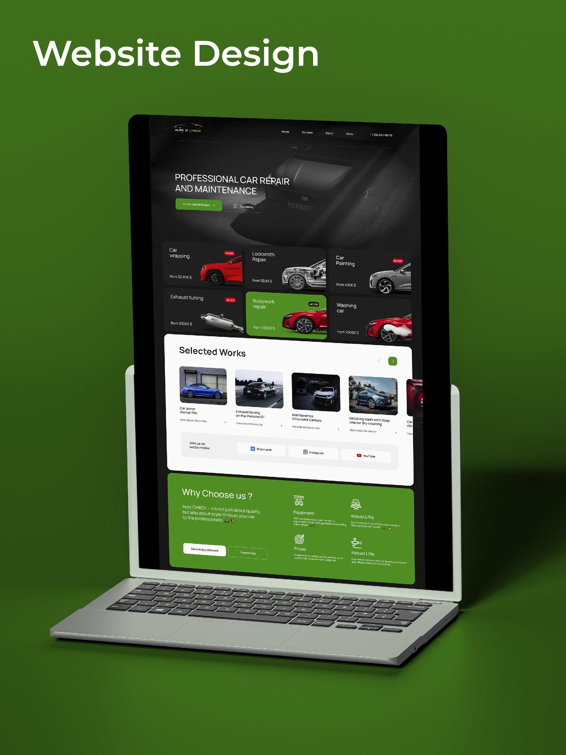
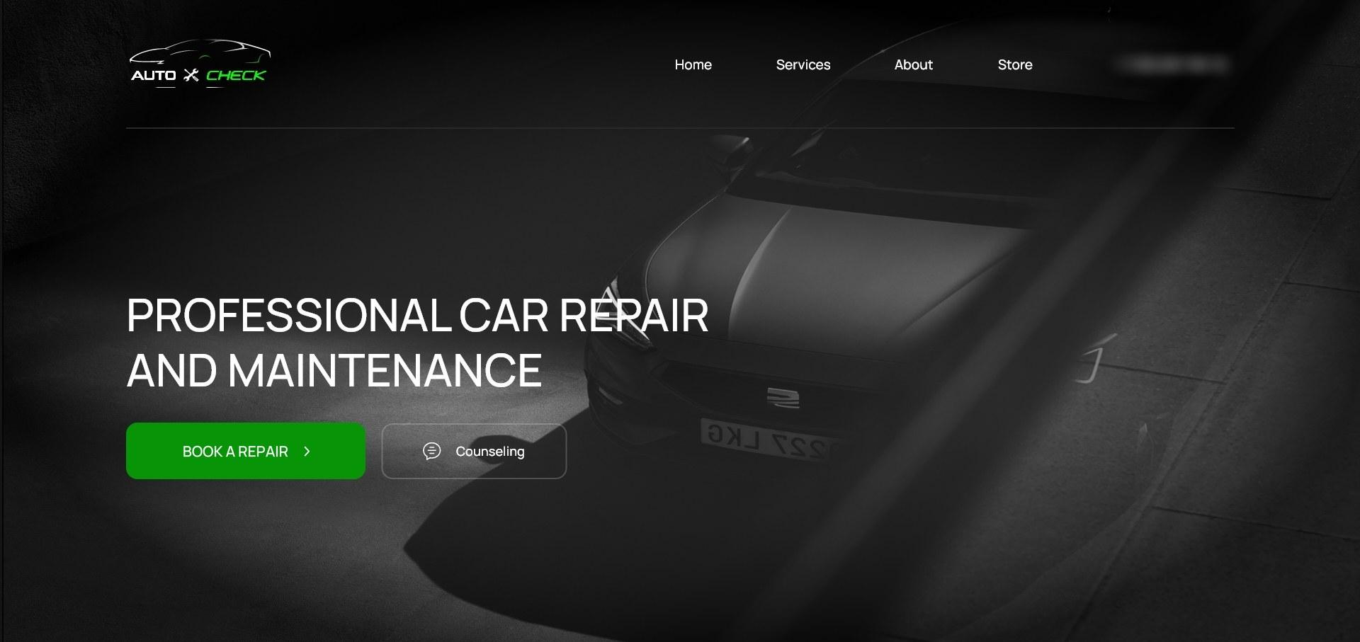
Auto Check website concept: Professional car repair and maintenance, with a green booking button beside a dark car.

Act 1 · Before

A repair shop is judged before the first visit

People pick a garage the way they pick a dentist: on signals of competence. Auto Check needed an identity that looks like a workshop that does things properly, whether it's on a sign, a business card or a flyer.

  • The brand had to work in print first: cards, brochures and flyers are where a local shop meets people.

Act 2 · The work

How he built it

Structure

One identity, every touchpoint

The kit was planned as a system before anything was drawn: the mark, the colours, the type, and how they behave on a business card, a tri-fold brochure and a flyer. The website concept came later and plugs into the same system.

  • Every piece answers the same two questions: what do we fix, and why trust us.
System

Industrial type, spec-sheet honesty

The identity leans on workshop material: bold industrial type, spec-sheet layouts, a confident green, and dark automotive photography instead of stock handshakes. It reads like a place that torques bolts correctly.

  • No smiling-mechanic stock photos: the cars and the type carry the brand.
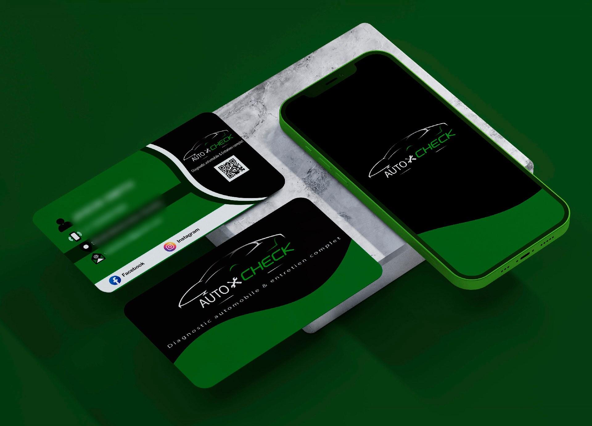
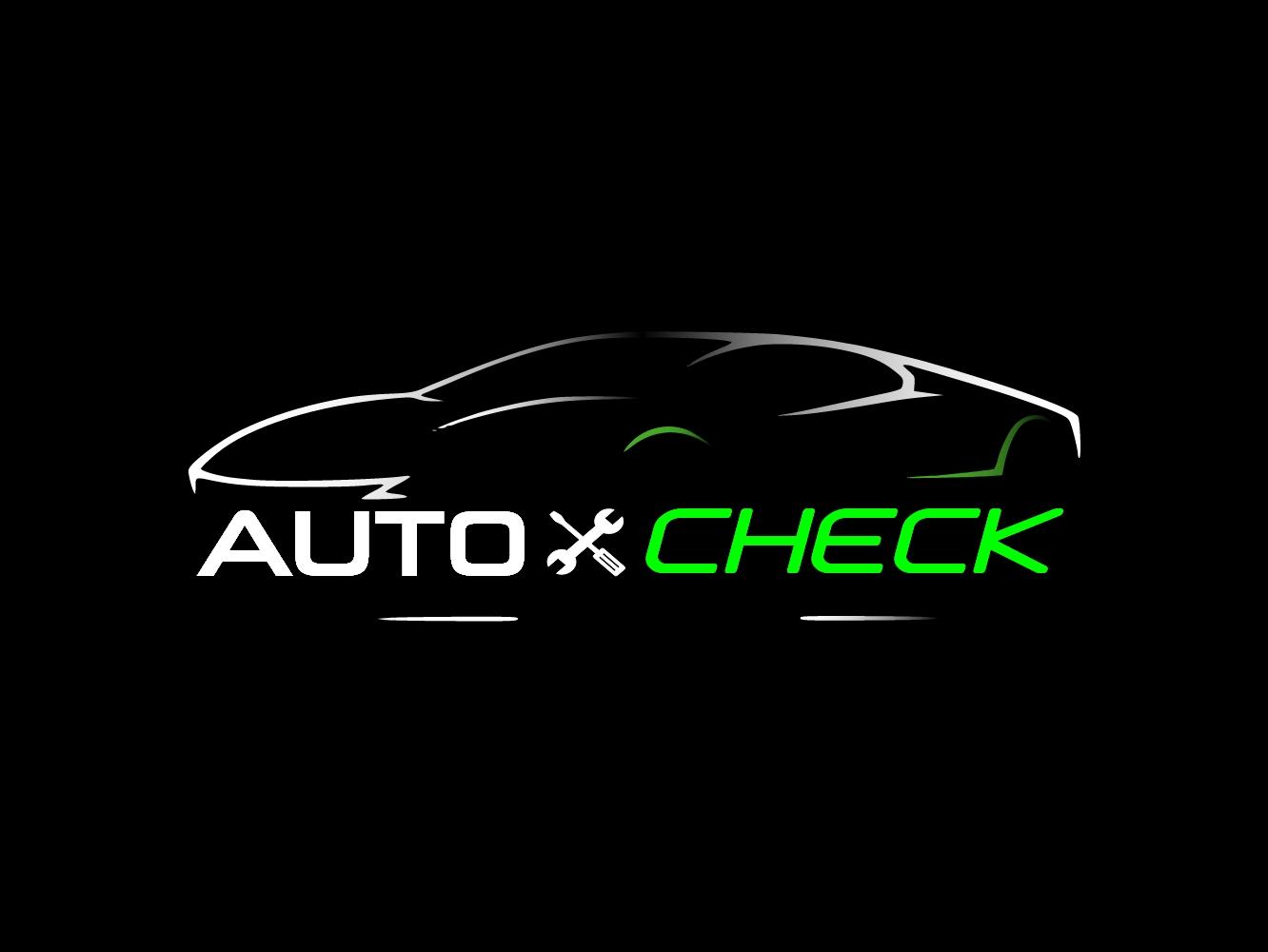
The Auto Check logo mark.
The Auto Check mark, designed for the shop.
Craft

Print that works on a counter

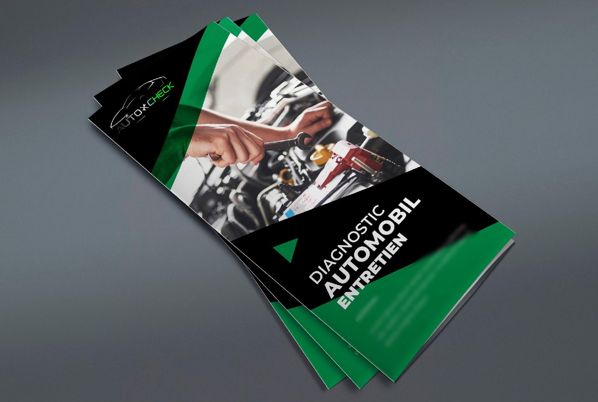
The business cards, tri-fold brochure and flyers carry the system into print: services laid out like a spec sheet, contact details where a hand reaches first, and the green used only where something needs to stand out.

  • One accent colour, kept for the things people act on.
Auto Check tri-fold service brochure.
The tri-fold service brochure.
Build

The website concept: one job, booking

On top of the brand, he designed a website concept: a page per service, structured for local search, and a booking flow that asks only what the workshop needs to confirm a slot. Everything on the page points at one action.

  • The website is a concept, designed but not commissioned.
  • The form asks four things; every extra field costs bookings.
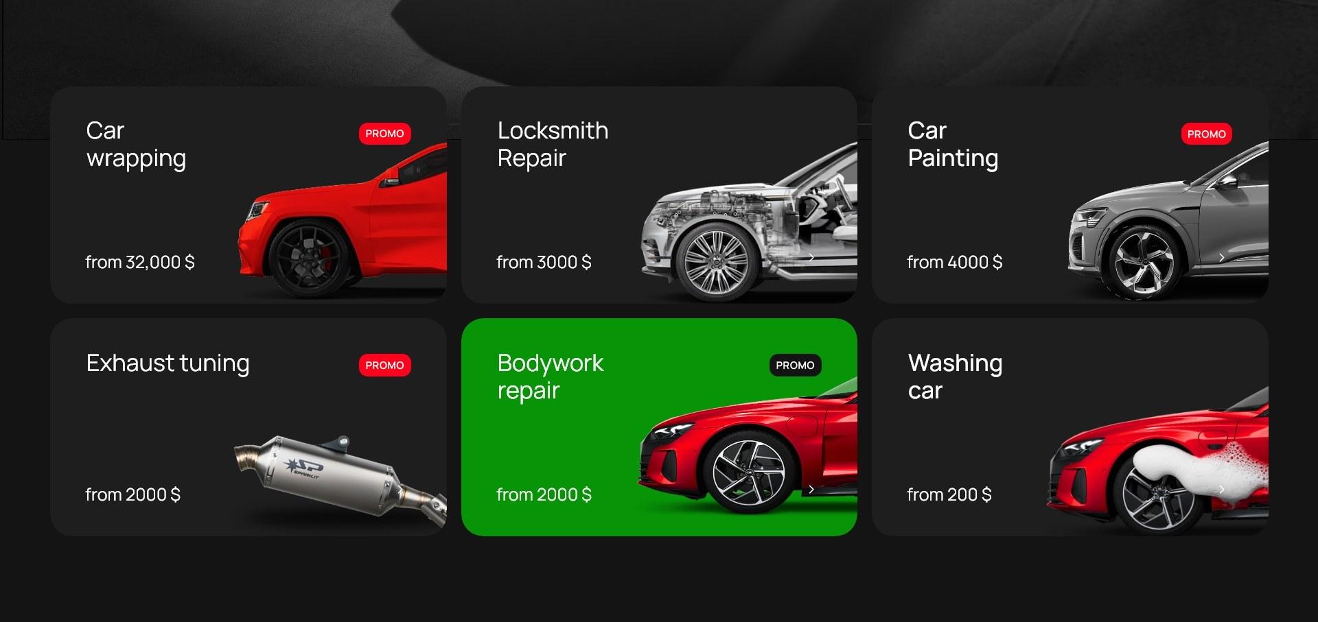
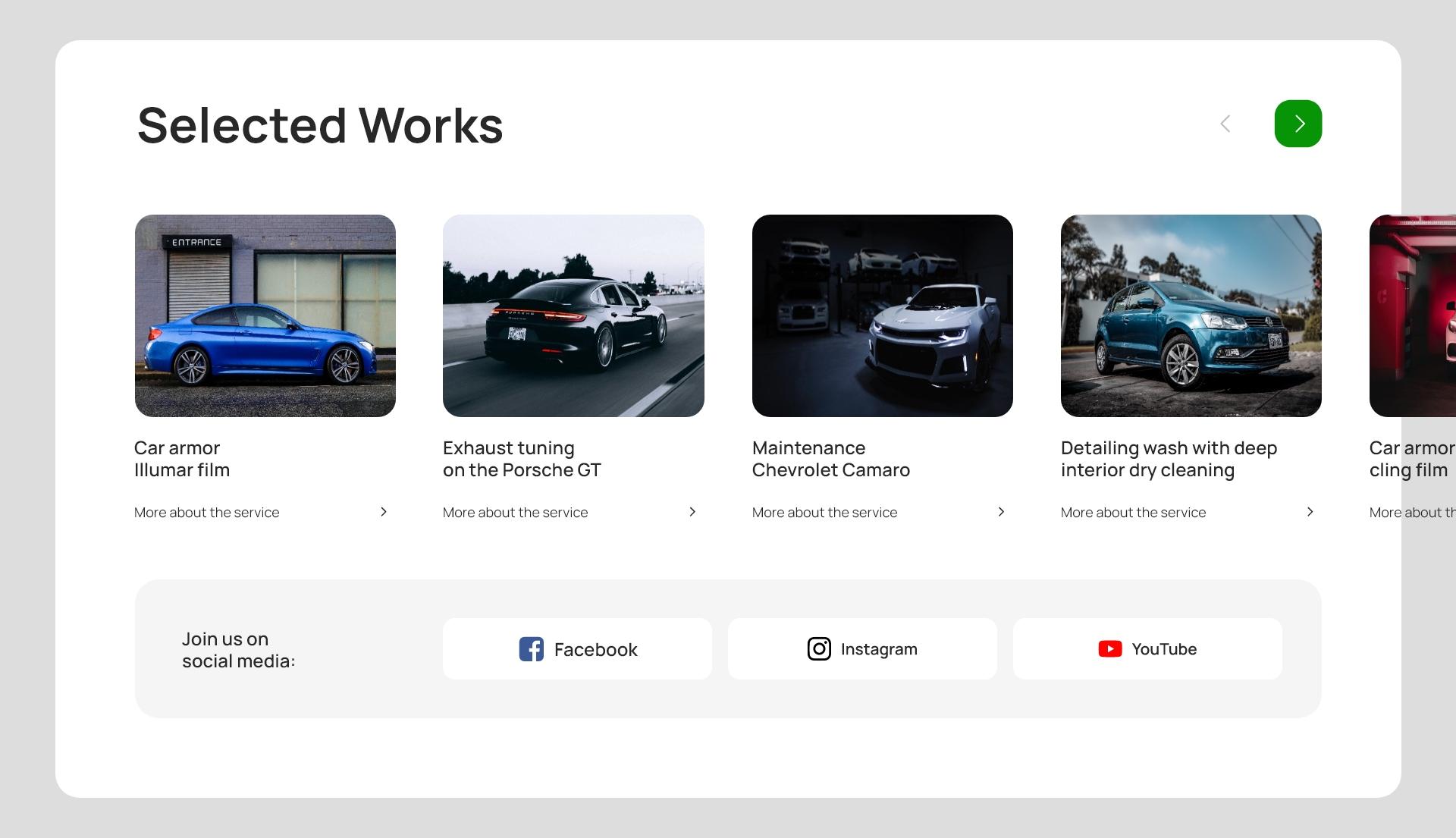
Auto Check website concept: service cards, each linking straight to booking.
Website concept: service cards, each one a direct path to booking.

Look closer

Click a number

A goes and stands on it, then explains the decision.

Auto Check website concept: Professional car repair and maintenance, with a green booking button beside a dark car.

Act 3 · After

A brand in use, a site ready to build

The shop got one consistent identity across its logo, cards and print. The website concept shows where the brand goes next: services that are easy to understand, visible trust, and booking as one obvious action instead of a phone number buried in a footer.

The identity and print kit went to the shop. The website concept shows the next step: a storefront that convinces in ten seconds and is one tap from a confirmed appointment.